
The Challenge (The Problem)
AI tools often feel cold, complex, and overwhelming. The challenge was to create an interface that felt sophisticated but also human and approachable. I needed to organize complex feature sets into a layout that a user could understand in under 5 seconds.
Key Obstacles:
- Communicating "Abstract AI" concepts without being confusing.
- Differentiating the brand in a crowded "Dark Mode SaaS" market.
- Guiding the user smoothly from "Curiosity" to "Purchase" (Pricing).
The Visual Strategy (The "Why")
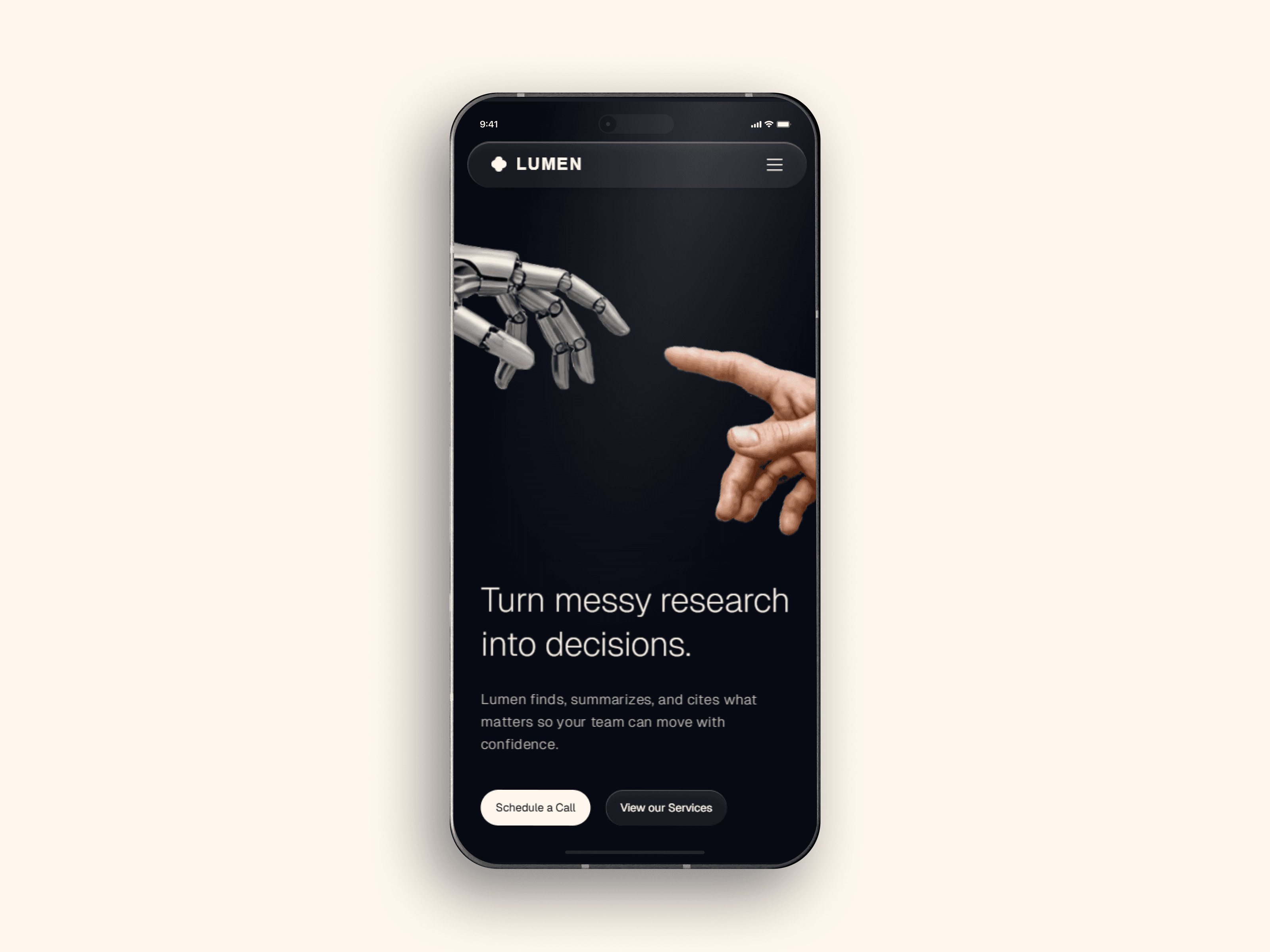
A. The "Creation of Adam" Metaphor
For the hero section, I chose a visual of a robotic hand reaching for a human hand. This wasn't just decoration; it visually communicates the core value proposition: AI assisting human intelligence, not replacing it. This creates an emotional hook instantly.
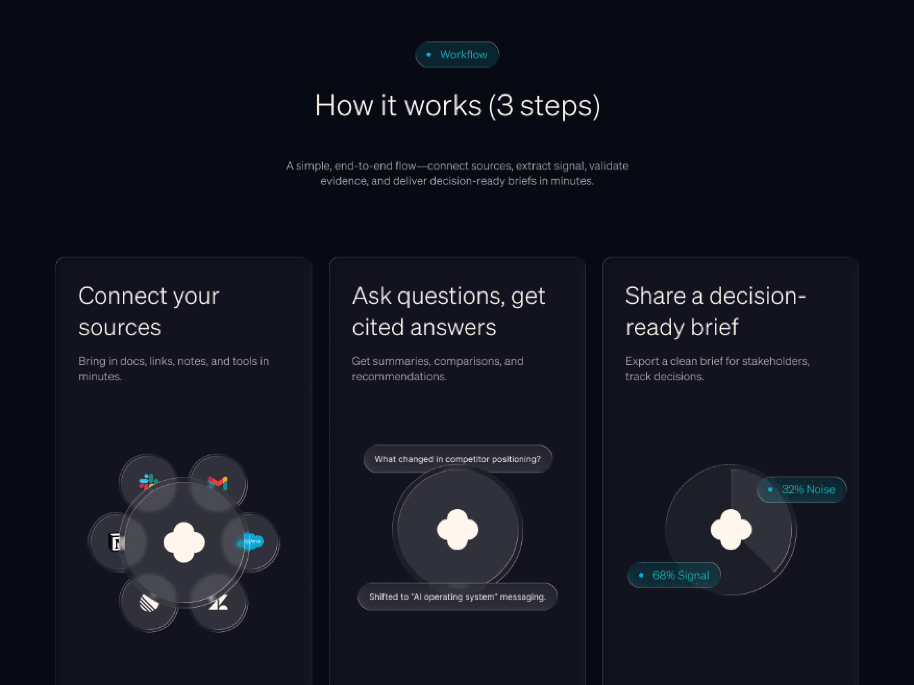
B. The "Bento Box" Grid
To handle the 'How it works' section, I utilized a modular grid layout (Bento style). This allowed me to break down the 3-step process into bite-sized, digestible cards. This reduces cognitive load and keeps the user scrolling.
C. Premium Dark Mode
I opted for a deep charcoal/black palette (#070A12) rather than pure black. This reduces eye strain and allows the neon accent gradients to pop, guiding the user's eye specifically to the Call-to-Action buttons and key metrics.
The Outcome
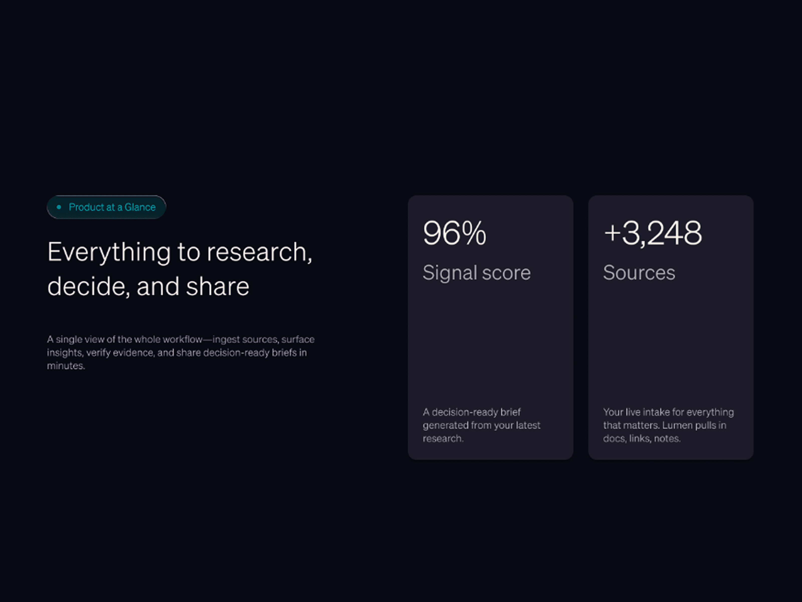
The final design resulted in a seamless narrative flow. The high-contrast hierarchy ensures the primary CTA is never missed. The layout is fully scalable, allowing the startup to add more features or testimonials without breaking the design system.