The problem
Going out gets decided twice. The first decision — are we going out tonight — takes a second. The second one — where — takes forty minutes of open tabs, screenshots and a group chat slowly losing the will to live. By the time somebody finally picks a place, the table is gone.
STN exists for that second decision, and treats it as one problem rather than three: find somewhere, agree on it, book it, without leaving the app or the conversation.
One tap instead of a shortlist
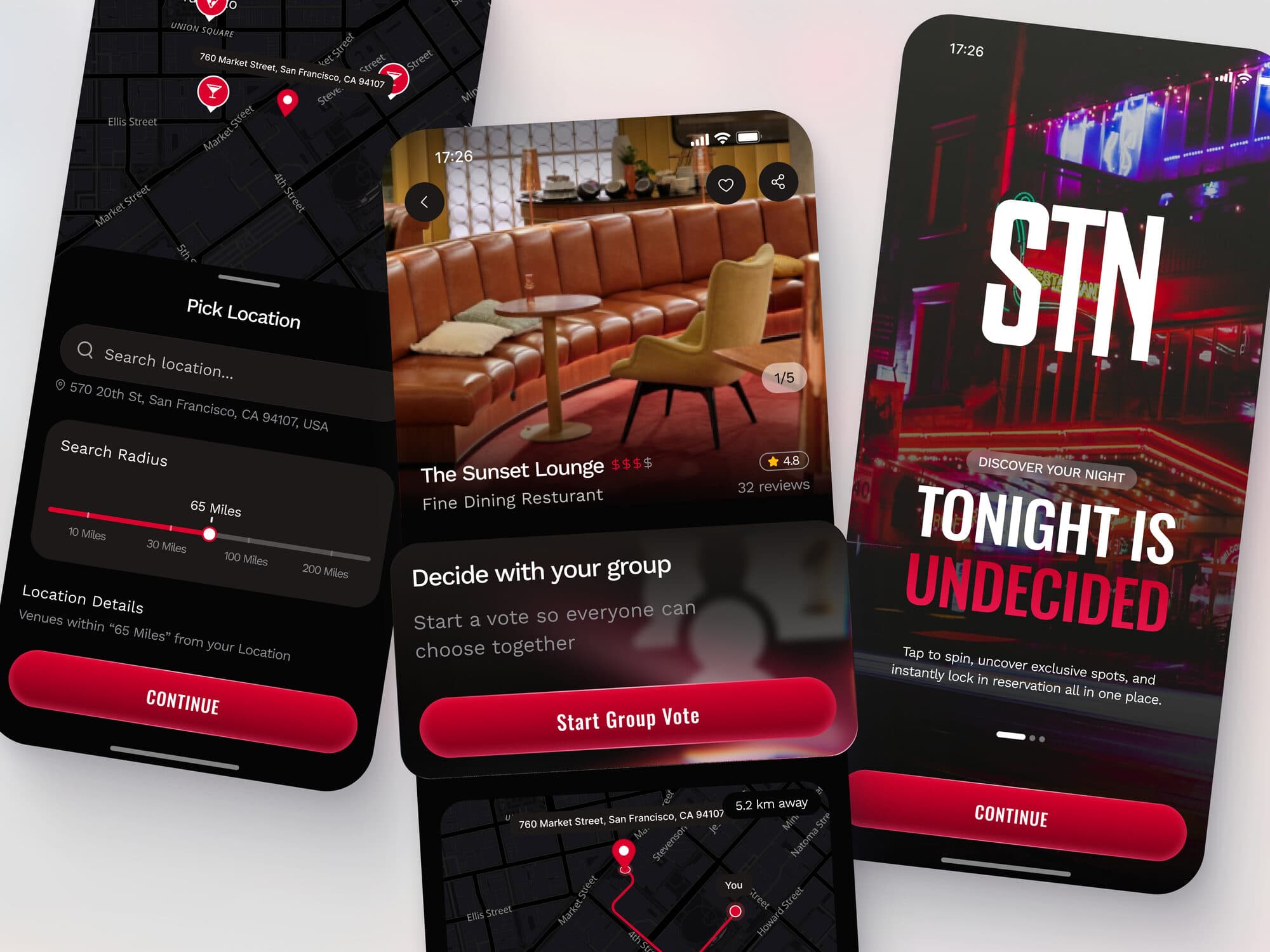
The home screen doesn't ask you to browse. Tonight is undecided is the entire proposition: tap once, get one place, with everything you need in order to say yes or no to it.
A list of forty venues sorted by rating isn't a decision — it's homework, and the app's job is to end the evening's admin rather than add to it. If the first spin is wrong, another one costs a tap, and every result is bookable from exactly where it lands.
Boundaries before suggestions
Nothing gets suggested until the app knows where you are and how far you're willing to go. Location first, radius second, on a slider marked in the units people actually argue in — because a 65-mile radius is a decision about the evening, not a setting buried in preferences.
Whatever you choose is read back underneath it in plain words: venues within 65 miles from your location. The number is never left to be interpreted, and the first result is never a surprise.
The venue card carries the whole decision
Photography at full width, then price tier, rating, review count and distance — on one screen, in that order. Nothing that would make you leave the card to make up your mind, and nothing that makes you scroll to find the price.
The booking action sits on the same card. It's the shortest line I could draw between this one and a reservation, and every screen in the flow is measured against it.
Agreeing is part of the product
Almost nobody goes out alone, so the app can't hand the hardest part — getting four people to agree — back to a group chat. Start a group vote puts the same card in front of everyone and returns a result instead of an argument.
One person still books. Nobody has to be the one who chose, which is the social problem underneath the product problem.
A dark interface for a dark room
This app is used at night: low screen brightness, one hand, usually while walking or talking to someone. So the interface is near-black with large type, every control within thumb reach at the bottom of the screen, and exactly one accent colour.
The red never decorates anything. It marks the single action you're meant to take next and nothing else — when the rest of the screen is dark, the one warm element on it is the instruction.
Where the twelve weeks went
Product strategy first — deciding what the app refuses to do, which is most of what shaped it. Then the interface and a design system tight enough that new screens cost hours instead of days: one type scale, one spacing rhythm, one accent, a card that works as a result, a favourite and a vote.
Then motion and engineering, with the same test applied to every screen: does this get someone closer to a booked table tonight, or is it just nice?
“Great work. Very professional!”